
The way that we access the internet has changed a lot over the years. Since smart phones have dominated the market, more and more people are making internet searches from their mobiles. In fact, nearly 60% of all online searches come from smartphone users. This means that mobile responsive web design is now essential.
Because of this, the priorities for good web design have changed. Everything must be made to work on mobiles. This is called mobile-first web design, and is a standard that even Google now works to.
What Is Mobile Responsive Web Design?
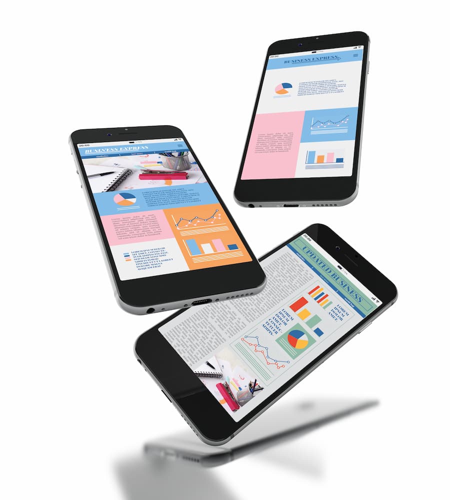
When a website is responsive, it can adapt to any screen size. This means that your site will look and function correctly on a desktop, tablet and mobile.
You can test if a website is responsive by going onto your desktop computer. Open up a site, then adjust the size of the window. A fully mobile-responsive site will adapt to the size that you make the window. It might look a bit different, but it will still be attractive and all the functions will still work.
Google Mobile-First Indexing
In response to the huge uptick in mobile searches, mobile responsive web design is now a ranking factor and affects Google indexing. This means that Google’s bots are indexing only the mobile versions of the whole web.
If your website is mobile responsive, you can sit back and relax. Google will automatically crawl the mobile version without you needing to do anything.
What Happens When Your Web Design Isn’t Mobile Responsive?

Not optimising your site for mobile users is, to be blunt, a terrible idea. You’ll be missing out on the majority of searches, reducing your overall traffic and user engagement.
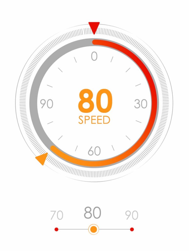
Studies show that users are likely to abandon websites if they take longer than just 3 seconds to load. This gives you a very short window of opportunity to get your user’s attention. For large webpages to appease this tiny time frame, they sometimes turn to AMPs.
What Is An AMP?
AMP stands for accelerated mobile pages. These are designed for speedy loading, to meet the demands of mobile users. They only deliver the bare bones of a page, so no time is wasted loading extra features that aren’t essential to the page’s experience.
Google can serve cached copies of AMP pages, which means that the link can load as fast as possible. There are a couple of drawbacks to this. The cached versions of your AMP pages are hosted on Google’s servers, so if you want to track conversions this won’t benefit you.
AMPs are most successfully used for news-type content, where users will want to read text without waiting for the rest of the site to load. If you have a business website where you want users to learn about your brand identity, you’re probably better off with a responsive website. This allows you to be more creative with your web design and express your business through images, colours and features that AMP’s don’t support.
Are AMP Pages Good For SEO?

No. AMP pages have their uses, but you shouldn’t consider them to be part of your SEO strategy. Although AMP pages are faster to load, they aren’t considered to be best practise for SEO.
However, fast loading time is a ranking factor. So, to increase your website’s ranking and visibility, you should put your efforts into optimising your standard site with high quality content and fast loading speeds.
Why Your Site Must Have Mobile Responsive Web Design
Let’s be clear: if your competitors have mobile responsive web design and you don’t, you are very unlikely to outrank them. This can have a devastating impact on your business, leaving you with less users and less website traffic.
Don’t get left behind! Invest in a site that’s fully mobile responsive to ensure that your website can be found online by anyone.
Written by Alice Farley


