The way we interact with websites has been studied extensively. As a result, there are many psychological principles and theories which are used by web designers. These practices are research-backed guidelines which can help to create more successful web pages. Of course, there will be circumstances where these principles can be applied, and others where they can’t. It takes a talented web designer to know exactly how and where to use these techniques to the best success.
Gestalt Design Principles
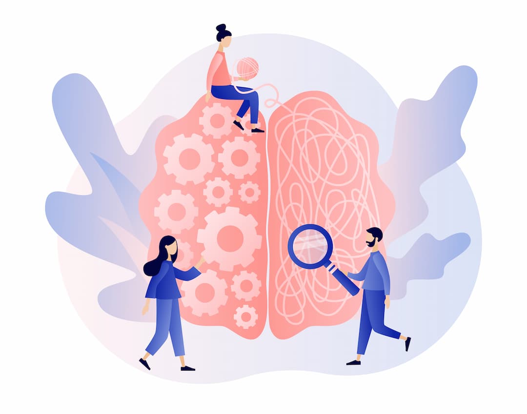
Gestalt Principles are all about human perception. They can be applied to all manner of design projects, not just web design. When using Gestalt design principles, your audience should be able to understand your design better as a whole. The idea of these principles is that if a design makes sense as a whole, it is successful. The smaller elements don’t necessarily have to be connected or make sense on their own, as long as everything works together.
There are a few main parts of Gestalt design principles:
Emergence & Reification
The principle of emergence essentially means that we can understand what is going on without needing all of the information. This is how we’re able to look at abstract paintings made up of blotches and splodges and make out what it is. The mind can look at the overall picture without needing to understand all of the smaller parts.
Reification means changing something abstract into something real. The mind can understand incomplete images, and this often produces a pleasing result. We have hundreds of thousands of familiar patterns stored in our memories, and this means we’re able to recall patterns and use that knowledge to understand similar images. For example, if we were to place three circles an equal distance apart, with one at the top and two at the bottom, then cut a small segment out of each, your eyes would see a triangle.
Positive Elements & Negative Space
When looking at an image, we will naturally separate figures and subjects from their backgrounds. This helps us to understand what’s going on in an image. It’s not always easy to determine what the subject is and what the background is. In this case, the image may be confusing or present some sort of illusion.
As a general rule, the larger object will be seen as the background, and the smaller object will be the subject. Convex shapes also tend to be perceived as subjects, whereas concave patterns are more often backgrounds. These are not hard and fast rules in all circumstances, but are a good practice to follow when creating a clear and understandable design.
Similarity, Proximity & Continuation
Similar objects can be grouped together, regardless of how close they are. This can be because they are a similar shape, size or colour. In contrast, you can make things stand out by ignoring those rules. This is usually done for prominent features such as call-to-actions, to draw the user’s attention.
As well as visual appearance, proximity can also group objects together. This can be because objects overlap, or because they are grouped together physically in an ordered fashion. Similarly, you can also create separation by positioning groups of objects further away from each other.
Finally, the law of continuity dictates that the human eye will always follow the smoothest path. This means if you’re using lines in your design, no matter how they cross over or interact, users will always see them in the most straightforward way that they can, regardless of how you drew them. This can be used to your advantage, as the eye will predictably be drawn in the same way as long as you use simple lines. Put objects that you want to draw attention to within the path of lines.
Symmetry
Humans like symmetry, and it’s in good design everywhere. Even Google’s homepage is central aligned and symmetrical. Grids can help you to implement symmetry and order.
Hick’s Law
Hick’s Law is all about decision making. The law dictates that when a user has more options presented to them, it will take them longer to decide which one is best. The more time it takes for someone to make a decision increases the risk of abandoning the process, thereby making no decision at all. Simplifying the choices and giving users only a small selection of items to choose from could increase the likelihood of a conversion.
That doesn’t mean to say that you have to completely eliminate some of your options or services. However, in an ideal world you would feed them to your audience in a manageable way. You could break things down into smaller steps or give your recommended options more prominence. The purpose is to make it as easy as possible for users to make a decision, not to obscure what your business is all about.
Use Psychological Principles Of Web Design Thoughtfully
As with many things, these practices need to be implemented with thought. It’s all well and good to know how humans react to visual stimuli, but if you take some of these rules too literally you could produce the opposite result to what is intended. We would always recommend using psychological principles to inform your web design, without letting them lead the way.
Written by Alice Farley