The first ever website was created by Tim Berners-Lee. It went live on the 6th of August 1991 and contained instructions for how to create webpages. This set the precedent for how the world would use the internet. Since then, the world wide web has been filled with more content that shares information with users.
Berners-Lee invented the webpage so that information could be shared between different computers on the network. By connecting to the internet, the webpage would be available to anyone with access to the network. At the time, it was solely used by scientists at CERN. However, in 1993 the World Wide Web became public domain, and websites were available to all.
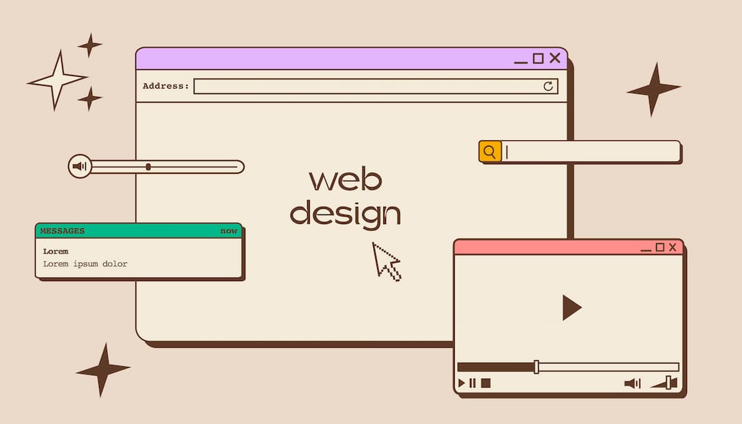
Web Design In The Early 90’s
The first ever website was lost for a while. Luckily, a project in 2013 restored the site, so we can see it exactly how it was. The page is entirely text-based. This is because the first versions of HTML only had functionality to create headings, paragraphs and links. Early web design was simple because of these limitations. Support for additional features would be developed over time.

In 1992, the first photo would be published on the internet. Shortly before 1995, there were 10 million web users.
Web Design In The Late 90’s
In 1995, JavaScript was invented. This new programming language allowed for deeper customisation alongside its predecessor, HMTL. JavaScript enabled websites to be more interactive and less static. HTML 2.0 would also release in 1995. This rapidly accelerated web design trends of the time, allowing sites to have graphics and tables, among other features.
Table-based layouts meant that websites could look more interesting, though they were still heavily text-based. GIFs and animation features meant that web design could be loud and chaotic, which became synonymous with websites of that time.
The development of new web design features meant that users began to demand better experiences on the internet. For that reason, Apple coined the term ‘user experience’, which we still use in the industry today.
It was around this time that Macromedia Flash became available. This mean that websites could have animations, therefore allowing web designers to be a lot more creative. Flash brought forward a lot more opportunity for what the web could provide users, but at the expense of slow loading times. It was also essential for users to install the Flash plugin for it to work properly, otherwise the web page would be blank.
Web Design In The Early 00’s
In 2000, there were over 17 million websites on the internet, with over 360 million users.

The early noughties were an exciting time for web design. Technology improved quickly, and the way we used the internet began to change. Blogging and social media exploded in popularity. WordPress launched in 2003, originally as an open source blogging platform. In the same year, MySpace launched, before Facebook followed in 2004. These platforms gave everyone an opportunity to express themselves on the internet, and offered users different ways to customise their online presence.
CSS became popular in the early 2000’s. This allowed web designers and content creators to work in harmony, as each part could be developed separately. CSS meant less code was required to create interesting features, and editing design and content independently allowed for deeper customisation with less maintenance.
The early 00’s was where web designers embraced the use of whitespace. Site began to look cleaner and were easier to navigate, without the chaotic elements that were popular in the late 90’s. Links could be added to icons and images as well as text, which further improved user navigation.
Web Design In The Late 00’s
The Opera Mini was released in 2005. This web browser allowed users to access the internet on their mobile phones, and was available on most popular devices at the time. Opera Mini used small-screen rendering technology, optimised on Opera servers before returning the data on a user’s phone.

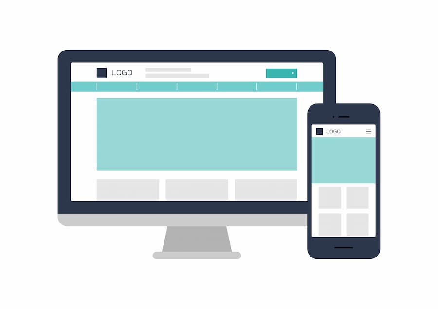
In 2007, Apple released the first ever iPhone. This marked a monumental change in the way we would access and use the internet. Responsive web design became very important very quickly, as more and more users browsed the web on their phones. However, the phrase ‘responsive web design’ wouldn’t come about until 2010.
Apple phones came with their own browser, Safari, installed. Safari was developed without support for Flash. This would pave the way for its eventual demise, with Flash sunsetting in 2020. While we’re on the subject of Flash, we should mention that Adobe bought it in 2005. This was good news, as it meant Flash was easier to integrate with web browsers and apps.

This era would change the way that we look at web design forever. Not only did websites have to look good on desktop screens, they also had to work on much smaller mobiles. The first ‘responsive’ web designs were simply different versions of existing sites, so not truly responsive.
If you had one of the earlier iPhone models, you might remember that the icons had shadows and highlights, giving them a ‘3D’ effect. This was popular at the time, and this sort of style was also
Web Design In The Early 2010’s
The rise of responsive web design would continue to shape the way we use the internet. By 2014, websites that wouldn’t work on mobile saw a dramatic decrease in traffic, making it an essential. Because mobile browsing was more common, websites saw more central-aligned content, vertical scrolling and larger images.

The early 2010’s also saw oversized headers become popular. This is a trend that we continue to see today, with large images above the fold taking centre stage. Web designers also favoured large footers. This allowed for better, more detailed site navigation without taking up too much menu space at the top of a page.
Web design became a lot more minimalistic, favouring simple designs with easy navigation. The quality of images became very important. As screen resolutions increased, images needed to be higher quality to meet the demands of users.
Speaking of minimalistic, remember those iPhone icons we mentioned earlier? In the 2010’s, those would change to flat design. This produced a cleaner, easier to interpret aesthetic, and also took less time to load. Efficient user experience became a priority, resulting in many web designers opting for flat design. In fact, flat web design is still used to this day.
Web Design In The Late 2010’s
In the late 2010’s, web design for desktop begins to look pretty different to mobile web design. This is because desktop screens can support more features, whereas mobile sites are limited by screen size and smaller processers.

Web design across all platforms was planned with a goal in mind. Lead-driven web design is the process of creating sites that convert. This normally means that users are directed to CTAs (call-to-actions) quickly. The oversized headers from the early 2010’s are perfect for this, which is why you often see phone numbers and ‘contact us’ buttons on headers as soon as you enter a site.
Infinite scroll is introduced on social media platforms, and bleeds over into some elements of web design. This encourages users to stay online for longer, taking advantage of the addictive nature of this feature.

GDPR laws also bring about change. Security and privacy become of paramount importance to internet users across the globe. The collection of personal information was regulated in the EU in 2018. This called for web designers to put together cookie & privacy policy pages, as well as offer users the ability to opt in or out of data collection.
Web Design In 2020 And Beyond
A lot has changed in the last 30 years, and we don’t expect the internet to stop evolving any time soon. During the pandemic period of 2020 and 2021, we became more reliant than ever on the world wide web. Millions of people were forced to work from home, which became an expectation of many jobs even after lockdowns were lifted.
Ecommerce web design boomed, as more small businesses needed the ability to offer their products online. The demand for clean, easy-to-use online shopping websites increased. Since then, many SMEs have seen the value in getting their business online. The benefits include increased sales, better brand awareness and resilience to major obstacles, such as worldwide lockdowns.
If you’d like to reap the benefits of a web design and digital advertising package, get in touch with Search4Local today. We specialise in websites and online marketing tailored specifically for the UK’s SMEs.
Written by Alice Farley


